i get so many questions about luca and gia's bedroom. the idea of a shared boy-girl space can be intimidating. finding a look that reflects individual personalities and interests, while maintaining a sense of cohesion can be hard to envision. since i snapped a few shots during last week's bath morning, i thought i would share how we make this work.
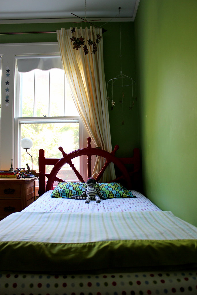
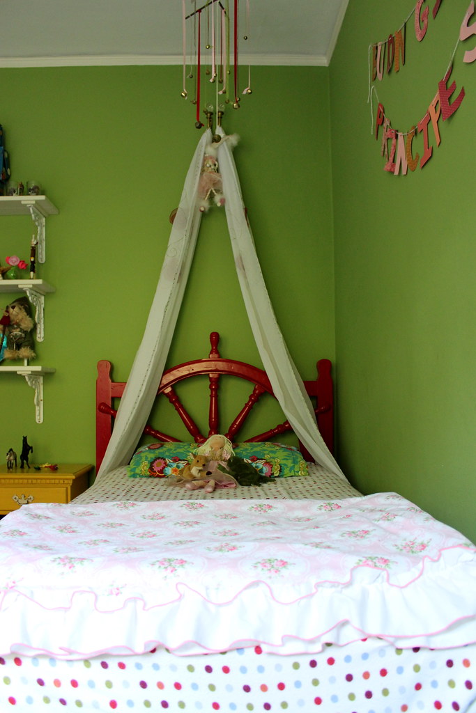
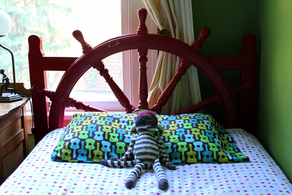
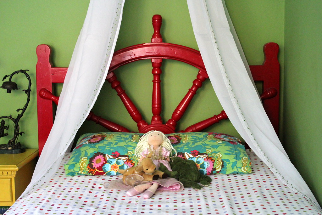
why is this space successful? first, the neutral green walls and yellow and white curtains can be paired with most colors. (both were also used in the nursery.) the ticking pattern on the curtains easily coordinates with all sorts of patterns. we used headboards painted a bright glossy red. (they were originally a dark brown stain and used in their papi's room growing up.) i also chose a few sets of fitted sheets to tie their beds together. this multi-color polka dot flannel is everyone's favorite. (bought at kohl's two winters ago on super clearance.) we grounded the room with these matching elements and a few key neutrals. now the stage was set for choosing more personal touches.
a big fan of his guitar playin' papi, luca also loves that his favorite colors green and brown are prominent in this print. as long as pink and flowers are combined, gia is a happy girl. (and i loved how this print picked up so many of the other colors in the room.)
my tip: you know what your kiddos like. or ask them what they want. then search for items you can all be excited about.
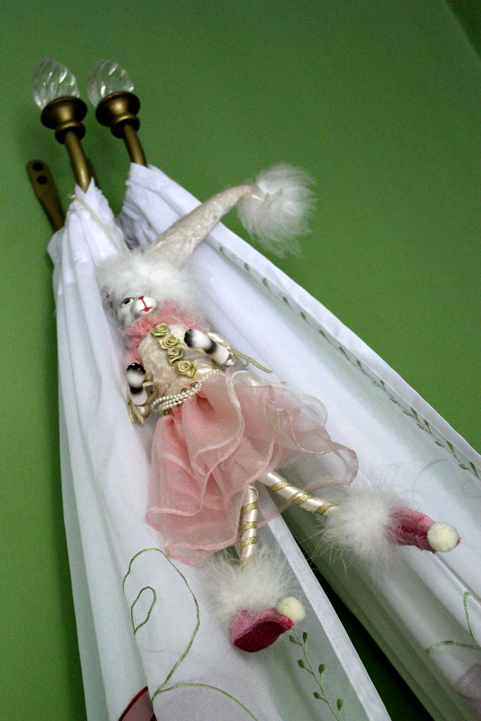
i also took the panels from gia's nursery at the old house and hung them from an unused set of curtain pullbacks to make a "princess" bed. one more way to set her space apart.
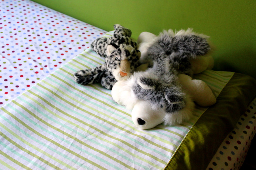
i found these flatsheets at goodwill for $2 apiece. total score. and these photos were artfully staged by two little helpers.
(i would love to make quilts for them this winter. just need to find the fabric. i am stalking some etsy stores for more vintage sheets. also need to get over my newbie quilting fears.)
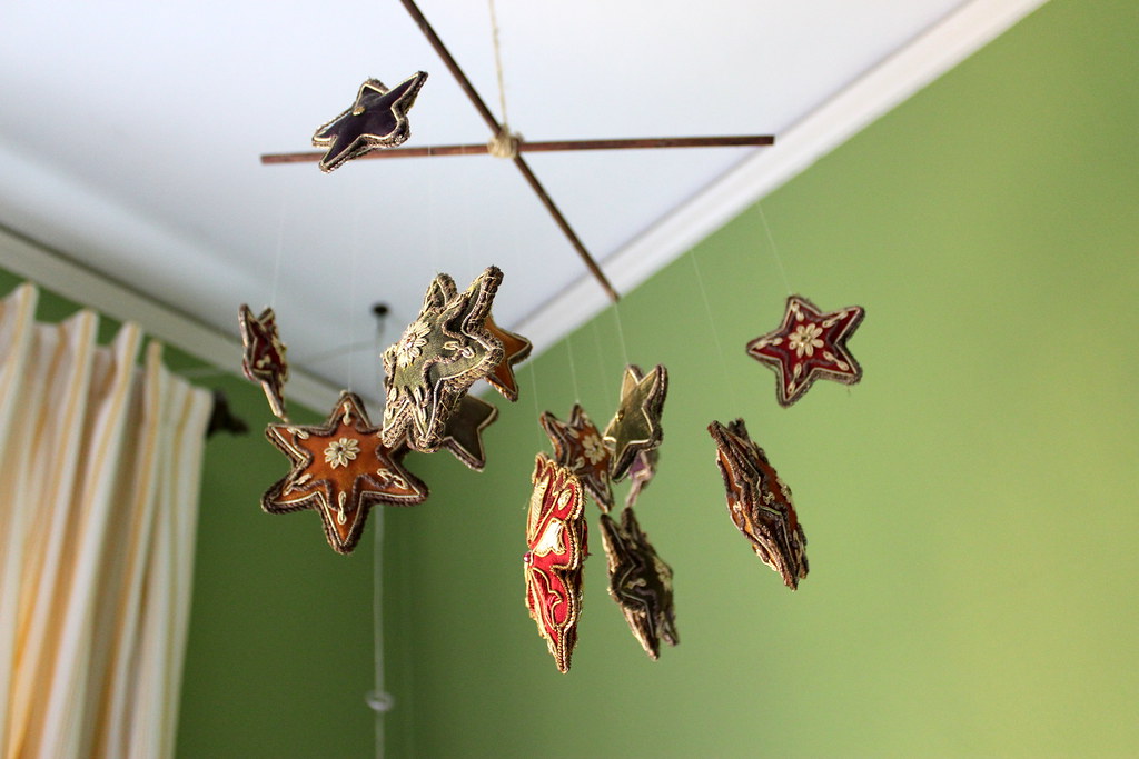
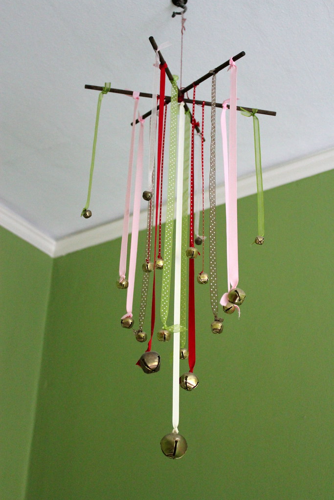
i have made a mobile for each of my kiddos when pregnant. there is no reason to stop using it once they move out of a crib. see photos of them in their original rooms here and here.
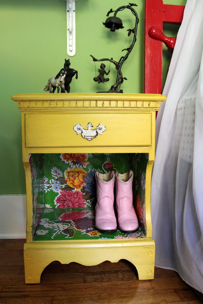
we use a small dresser next to luca's bed in lieu of a nightstand. it stores his clothes and holds a small lamp (inherited from the uncles) and books.
i painted this nightstand mustard-y yellow and added my favorite oilcloth to the inside for a little somethin' special. lots of gia-treasures are hidden in that drawer.
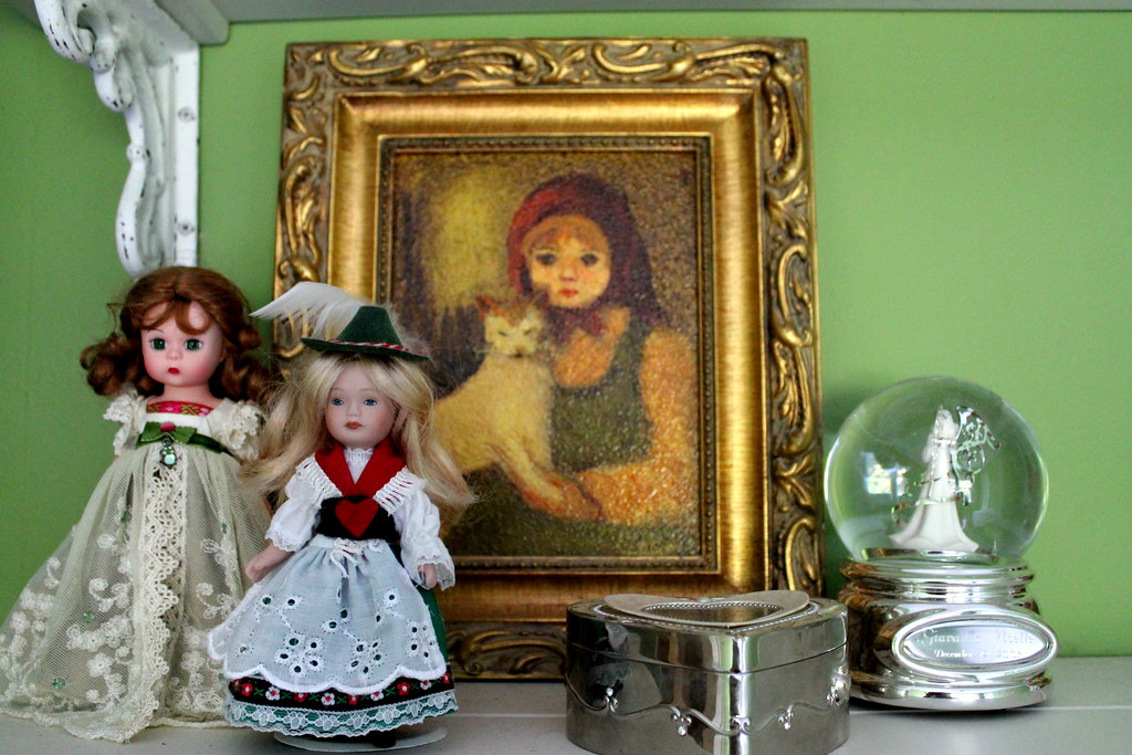
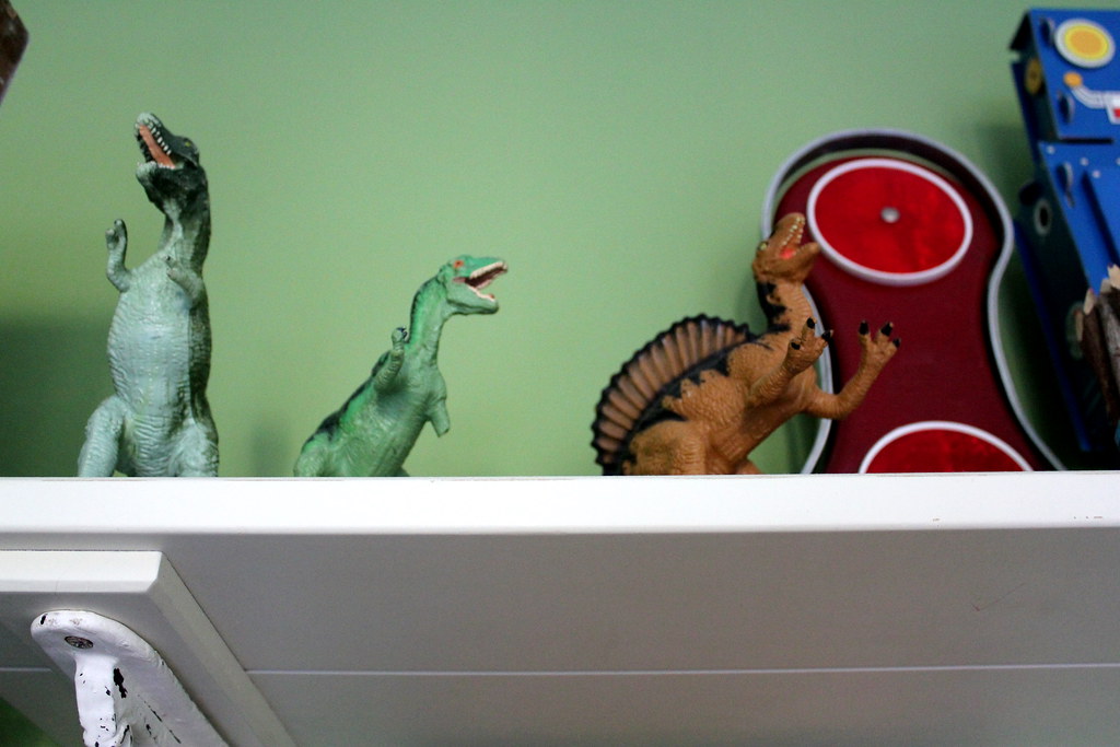
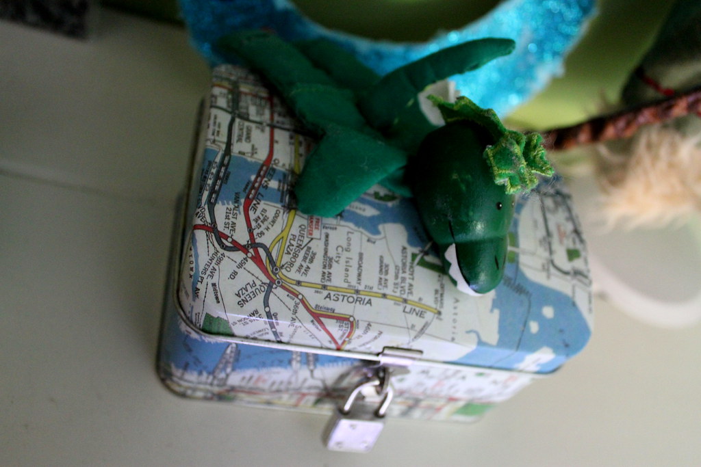
there are a set of three shelves on the only available wall (not housing a bed) and here we store all sorts of knick knacks. when enzo is up and about, it also holds anything i want out of reach . . . so i rarely have a good photo op. by grouping like items, the effect is not messy but fun and eclectic. (and yes, my kiddos climb on top of the nightstand to play with anything on the lower two shelves. so i have learned to a) keep reminding them to be careful and b) not be too attached to anything up there - it is just stuff (even if i really like it).
i would love to "finish" this room and say i have it all pulled together like i want. but i don't. oh well. luca and i have been creating art for his wall for months. gia needs a lampshade (and lightbulb) for her lamp. and the shelf displays need some work. but it grows as they grow. a row of tractors is replaced by star wars lego figures. there is an ever rotating set of stuffed animals lining the beds. new rocks and shells are collected to fill the jars. and sometimes things break (like our super awesome bookends).
(and for those interested, we have spent less than $60 in here spread over a year and a half. most items were inherited, handmade, repurposed, or thrifted. definitely a low budget, high style room.)
the plan is to move enzo in here next year. he and luca will share bunk beds and gia will stay in the princess bed. we'll see how the design evolves as we get closer to that transition.
(and now that i have my new camera, more photos of this room to come. my old one just couldn't take great shots in here - not enough light. maybe this even calls for an official room tour sometime this fall.)





9 comments:
i love the red beds!
you with your low-budget-high-style are my favorite. wish i could get some of that creativity my way :)
I am hosting a giveaway over at Sassy Sites. Come on by and join in on the fun! We would love to have you!
-Marni
http://sassysites.blogspot.com/
That's a great room! you definitely pulled off a theme that works for a boy & girl. Love the colors.
Absolutely love it! Great work on finding a happy median!
I hope you'll come participate in my link party today! It runs all week so come back and add more BOY projects! All About The Boy @ The Nifty Nest!
Liz
I love the princess canopy on the your little girls bed--seems so simple with the curtain stays too. I also love the eclectic feel of all the accessories and the use of bold colors. It all works and looks so beautiful, yet is individual to each of your kids. Super cute!
that ship's wheel head board brought me over, and i love the space. you really are making it work. love the oil cloth inside the nightstand, what a neat idea!
coming over from somewhat simple
It's funny how many people think it's strange (and maybe wrong) for a brother and sister to share a room. I shared a room with my younger brother until I was 12 and we moved into a new big house. It was really wonderful to be able to have a loved and trusted presence nearby at night.
Would love to know where you found the softy toy on Luca's bed. So cute and my son would love it.
Post a Comment
hey there. i love to read your comments! thanks for stopping by!